Apple’s Vision Pro spatial computer, a VR headset with pass-through video, hand tracking, and eye tracking, is not just another VR headset. It’s not just an expensive Meta Quest 3 with higher-quality displays.
It is those things, but it’s not just those things. There are moments when you really do feel, in your gut, that you’re doing things that are going to be the way it is at some point in the future. After a week of using Apple Vision Pro every day, one thought keeps passing through my head. “This is going to be great…one day.”
But that’s the rub. That greatness of this product feels like it is always just off in the distance somewhere. Really trying to use the Vision Pro as anything more than a media consumption device right now is an exercise in compromises and inefficiency, and even as a pure consumption device there are big drawbacks and tradeoffs.
If only it was lighter. If only it was less expensive. If only I could plug USB-C devices into it. If only there more apps. If only the apps were better.
If only.
When the “wow” moments pass (and there are some big “wow” moments) you’re left wondering when Vision Pro is going to do this, or why it doesn’t do that, and eventually decide to just go ahead and use your Mac or your iPad or iPhone to do what you want to do.
Some of Vision Pro’s shortfalls can be addressed with software updates, others are hardware related, but either way it’s hard to recommend this pricey face computer right now for any but the most die-hard early adopter Apple fans.
Incredible but limiting hardware
You have no doubt seen videos and screenshots online which show the point-of-view experience of Apple Vision Pro. It may look to you very much like using a Meta Quest 3 or similar competing consumer headset.
These videos in no way capture the experience. Apple’s micro‑OLED displays have incredible fidelity, color depth, and dynamic range. You don’t see pixels. There’s no “screen door effect.” In the right lighting, you can get a bit of lens glare but it’s less pronounced than with most other headsets.
Looking at rendered content on something like a Meta Quest 3 vs an Apple Vision Pro is like using an old 1080p TV vs a new 4K HDR OLED. Apple pulls a lot of tricks behind the scenes to make this work, like foveated rendering (where only the specific part of the screen you’re looking at is rendered in full resolution and everything else is a little fuzzy–just like your actual vision).
Foundry
Speaking of tracking: It’s kind of like magic. Just look at something and it immediately highlights. Pinch, even with your hand relaxed down low, and you’ll select it. There’s no need to wildly swipe and poke at the air in front of you and people near you will barely know that you’re doing anything at all.
“Look and pinch” is the primary means of interacting with visionOS, and it’s both technically impressive and limiting. After years of multitouch interfaces, having one touch point (per hand) feels like a handicap. Locking your gaze on things takes some adjustment, too. Our natural instinct is to look at something to target it but look away, which doesn’t work here. You have to keep staring at the interface element in order to operate it. Imagine turning off a light switch: You just look at it long enough to accurately move your hand toward it, but Vision Pro wants you to keep staring at it until the action is complete.
If you bring a window close enough you can literally poke and swipe at it directly, but with no tactile feedback, it’s not really a great experience. It’s like wrestling a ghost. It all works incredibly well, but it also gives you the sense that in a generation or two, it’ll be much more intuitive and fluid.
The same goes for pass-through video. The view of the outside world is both the best I’ve ever seen and still not good enough. Apple keeps the entirely photon-in-to-photons-out latency down to 12 milliseconds or less, but the video feed quickly becomes grainy and colors mute when you leave a brightly-lit area. I don’t think of my home as particularly dark, but my typical lighting wasn’t bright enough to get great fidelity unless I turned on a lot more lights than I’m used to.
Sound quality from the little speakers integrated into the strap is surprisingly good, and though it “leaks” to others pretty easily at higher volumes, it’s a comfortable way to mix outside audio (which you want if you’re seeing the outside world) with spatial audio from the apps you’re using. AirPods Pro make a great way to prevent others from hearing your content, but they typically prevent you from hearing the world, too. Ideal for isolated, immersive experiences but not so much for augmented reality.
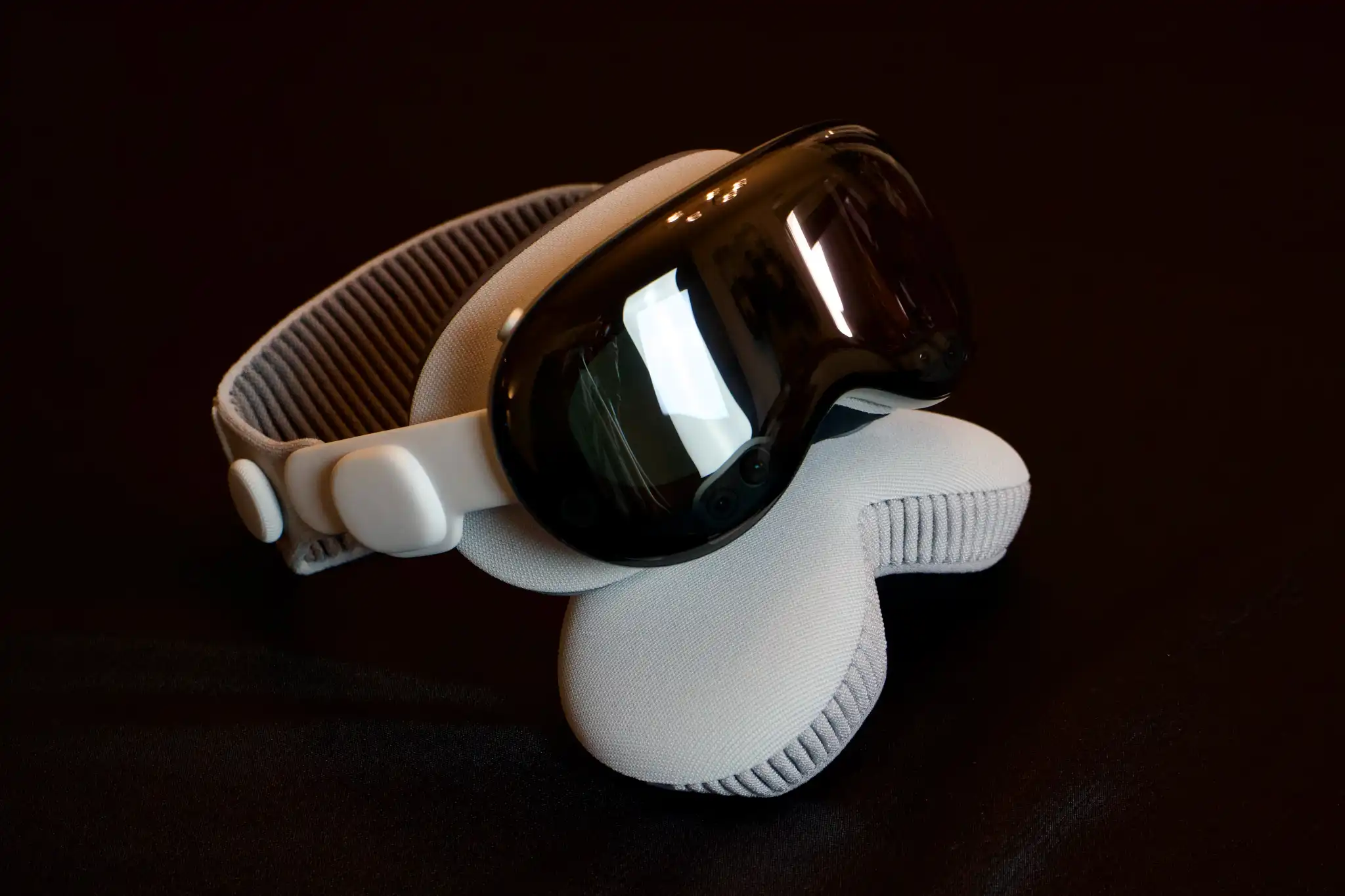
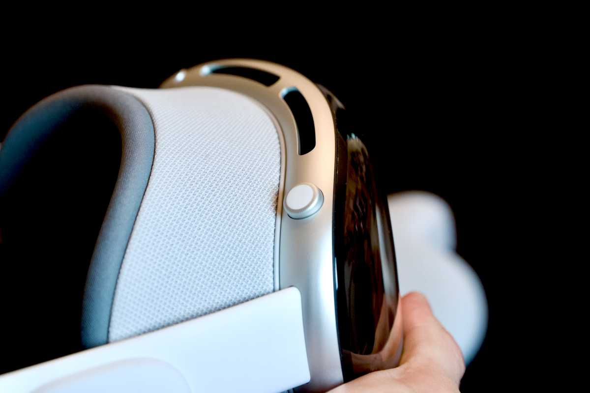
The straps work well—the dual loop band distributes the headset weight more evenly, the light seals are comfortable and block out light very well, though the magnetic attachments can’t keep them on well enough. It can be tricky to physically handle the Vision Pro without accidentally popping the light seal off. The tendency is to grab it by the light seal to remove it, but Apple instructs you to grab the front display instead. Otherwise, you risk separating the light seal from the display and dropping it.
The weight, around 600-650 grams, is not necessarily heavy in itself, but all that weight is hanging out in front of your face instead of distributed around your head. So to keep things in place, the strap has to place significant pressure on the light seal. Apple’s pathological aversion to plastic means they used aluminum and glass to give the device a premium feel, but I’d take plastic any day if it shaved 150-200 grams off this thing.
The entire front of the device is incredibly glossy, making it difficult to see what’s going on and diminishing its trademark feature, EyeSight. It’s definitely a nice idea but it simply does not work as Apple advertises and merely serves to add cost and complexity for no good reason.
And while it looks clumsy in pictures, the external battery pack was the right move. It’s not very cumbersome in practice, and any weight that can be put somewhere else is a good thing. Eventually, it will all need to be integrated, but for the next few years, making the headset lighter by detaching the battery pack is the way to go. Finally, there’s no data input at all—no USB-C, no Lightning, nothing—though Apple sells a $300 Developer Strap that replaces the audio strap with a dongle that “provides a USB-C connection between Apple Vision Pro and Mac.” The USB-C port on the battery pack is for power only and won’t recognize any other peripheral devices plugged into it.
Early, often clunky software
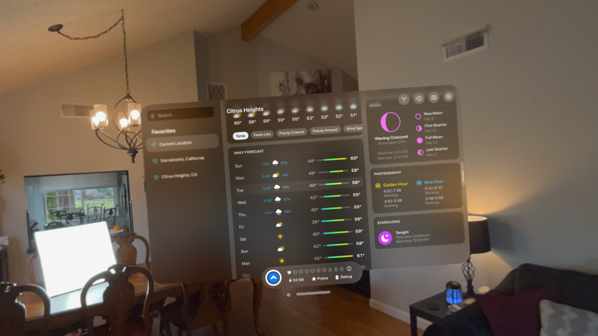
The software situation is best described as “fledgling.” For the world’s biggest and most valuable tech company with decades of software to lean on, it’s a little frustrating how limited some of the apps and interfaces are. With the exception of immersive video and some games, everything feels like a floating iPad window, even the ones that aren’t iPad apps.
You can resize windows freely, but they just don’t look and feel like the “big boy” versions you get on a Mac. Third-party apps are mostly iPad apps, with fewer than a thousand visionOS-specific apps. Those that are there feel rushed. They’re frequently buggy, often just a floating window that resembles an iPad app, and feature “spatial” features that are gimmicky. For example, Carrot Weather is great, but it’s little more than an iPad app with an option pop-out “full globe” view that makes you say “oh neat!” but isn’t actually useful. I want to look around the real world and see isobars and radar precipitation in the sky.
Foundry
In fact, most of what the Vision Pro experience amounts to is floating windows anchored in the spaces around you. I don’t mean to discount this technical feat. The windows are incredibly crisp and vibrant, and really appear to be an part of your real environment. They occlude the real world as appropriate, cast shadows on flat surfaces, and never waver even a millimeter.
But they’re also always anchored to the space, instead of to you. If you want a window to follow you as you walk around, you have to literally grab its little window bar at the bottom and carry it. More than once I have awkwardly been unable to find a running app because it’s in the other room. The first time you walk around your house looking for where you left the Safari window hanging, it’s kind of amazing. Every time after that, it’s frustrating.
Why can’t I double-pinch the window bar to anchor the window to me, instead of to its position in my living room? Something so simple feels like a slam-dunk visionOS 2.0 feature.
If you want to run multiple apps at once (and of course you do), you’ll quickly find yourself running out of physical space. Layering windows on top of each other is a poor experience that makes it hard to select what you want or switch to the desired app, so you find yourself arranging these large-ish windows in the air all around your desk or couch or whatever. Then you have to turn all over the place to use different apps. Again, it’s amazing at first, and quickly becomes an exercise in frustration when you start asking, “Where do I put all this stuff?”
Foundry
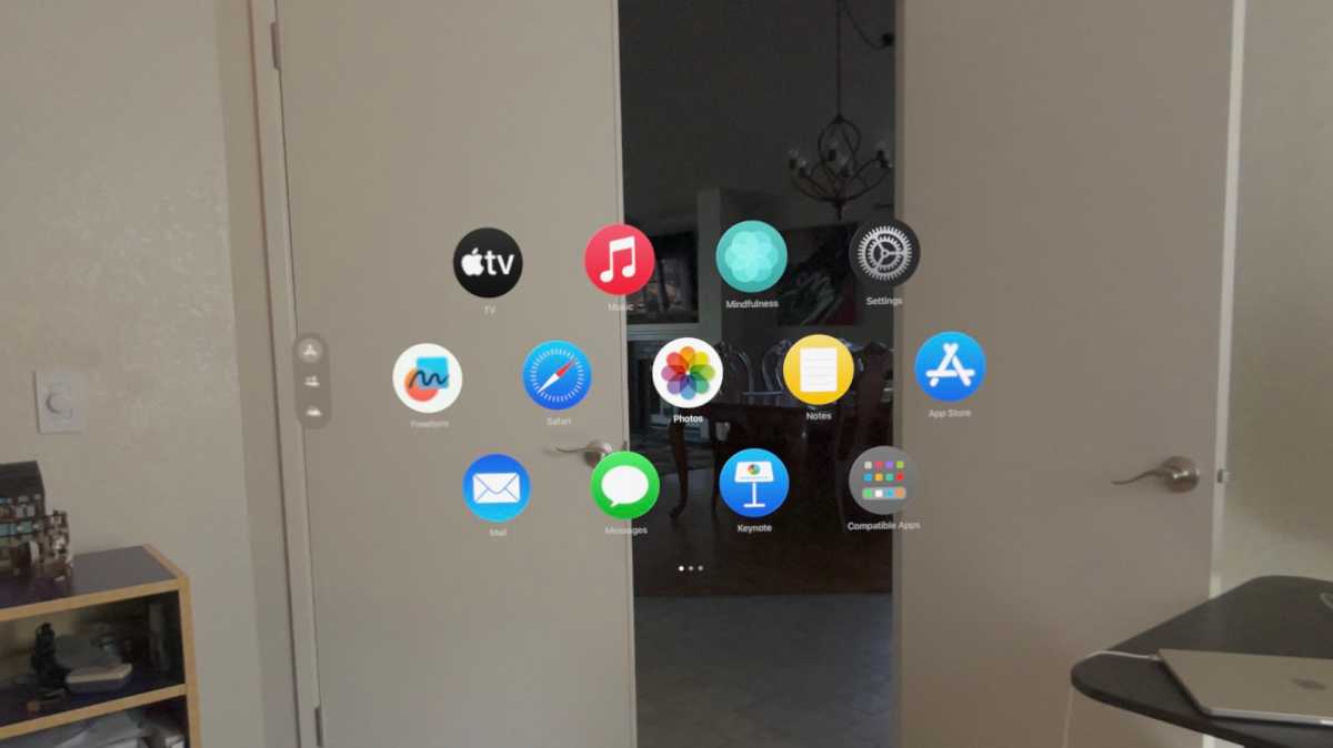
There are no window management features to speak of. A command that gathers and arranges all your windows around you, akin to Mission Control on a Mac, feels like an obvious omission. There’s nothing like Split View on iPad to let you glue two apps together. Something like Stage Manager would let you “stack” multiple apps and switch between them without finding new airspace to locate every app you want to run, but it’s not there.
App management problems aren’t just limited to the apps that are running. The Home View presents apps as little circles in a honeycomb-like array, with the first page full of fixed Apple apps and the next pages full of your apps, in alphabetical order. The first page is not in alphabetical order, confusingly. There is no way to change any of this, and it’s frustrating as hell. Perhaps most perplexing is that iPhones, iPads, and Macs have a dock but the Vision Pro does not. Top of the list for visionOS 2.0 is an entirely new Home View and app management experience.
It’s easy to complain about this stuff because the limitations and potential solutions to them seem so obvious. And yet, the experience of physically placing apps in the real world is kind of amazing. As limited as everything feels right now, it still hits you in your gut, on that very first day, just how useful it’s going to be to put apps in a place. One day, an AI-powered smart grocery list will be pinned virtually on your fridge, the way you used to attach a paper shopping list to it with a magnet. It will update automatically as you open your cupboards and fridge to see what is missing, and it will pop up into your view when you go to the grocery store, following you around and highlighting aisles and shelves with the items you need.
The possibilities for integrating computer-rendered graphics into the real world, combining interactivity, intelligence, location, and your own personal preferences, feel limitless. We have always been able to imagine these things, but this is the first product to deliver an experience that feels like it’s actually building the technology to make it happen, and maybe it’s not that far away.
Foundry
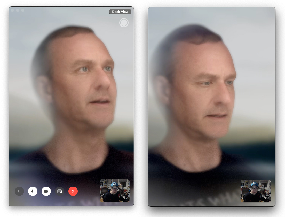
It’s also worth mentioning the apps that are simply missing, or just poorly represented. There are no Calculator or Weather apps. Nor can you not use Find My to locate your Vision Pro hardware, there’s no Find My app (even the iPad version) to locate your friends or other Apple stuff. The most obvious “spatial” candidate among Apple’s own apps has to be Maps, but you only get the iPad app. Bizarrely, there’s no Contacts app at all. Your contacts are synced and usable within apps, but there’s no place inside Vision Pro to manage them. Instead, there’s a top-level “People” section on the Home View, but that’s only a way to start FaceTime calls since there’s no FaceTime app either.
It all feels oddly half-baked for a company that’s in the position Apple is in today. Some apps and experiences are fantastic, while others feel incomplete or missing entirely.
Productivity, or lack thereof
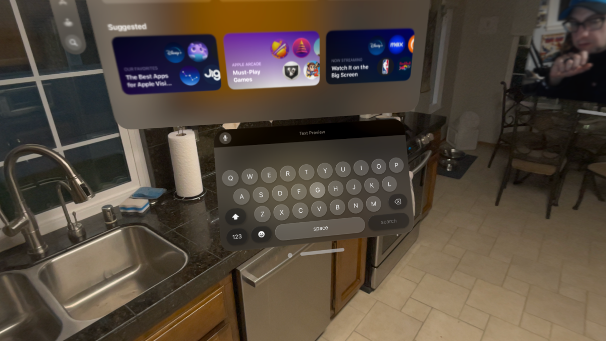
The keyboard is hilariously basic and next to impossible to use for anything more than entering URLs—if you want to type sentences, pairing a Bluetooth keyboard is mandatory. You can use dictation, but that’s even less productive than it is on iPhone or iPad because selecting text to make corrections with the “look and pinch” interface is kind of awkward.
Foundry
If you aim to be productive you really need a keyboard and touchpadat a minimum, and a MacBook at most. Here’s one of Vision Pro’s neatest trickss—just look at a MacBook that’s logged into the same Apple ID and a Connect button will appear floating above it. One pinch-select later, you’ve got a floating 4K virtual display with remarkable quality and fairly low, but noticeable, latency. But there’s only one, and it can’t even be a secondary display to your real-life MacBook display, which turns off. You can do the same with a Mac desktop using the Vision Pro control panel.
That limits the usefulness to those times when you just need a larger screen but don’t have room for it. When it comes to getting things done, a physical secondary monitor is going to be faster, sharper, and better in almost every way. Oh, and the audio will only come from your Mac instead of playing through the Vision Pro speakers for some reason.
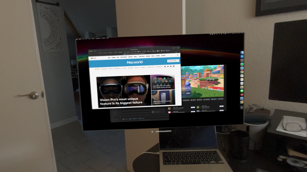
Foundry
When you’re viewing your Mac this way, adding visionOS or iPad apps to its left or right, you feel like it expands your capabilities at first. Focus on your task at hand with a Notes window floating off to your left, Safari to the right, and some streaming video playing off in the distance, or maybe Apple Music up above. And all you have to do is glance over at any of these windows for your Mac’s keyboard and trackpad to automatically control that app via Universal Control. It’s like magic, and it makes you feel like a productivity god. (It’s worth noting that a mouse will not work with Vision Pro. Even the mouse attached to your Mac will only work within your Mac display window. It’s a touchpad or nothing.)
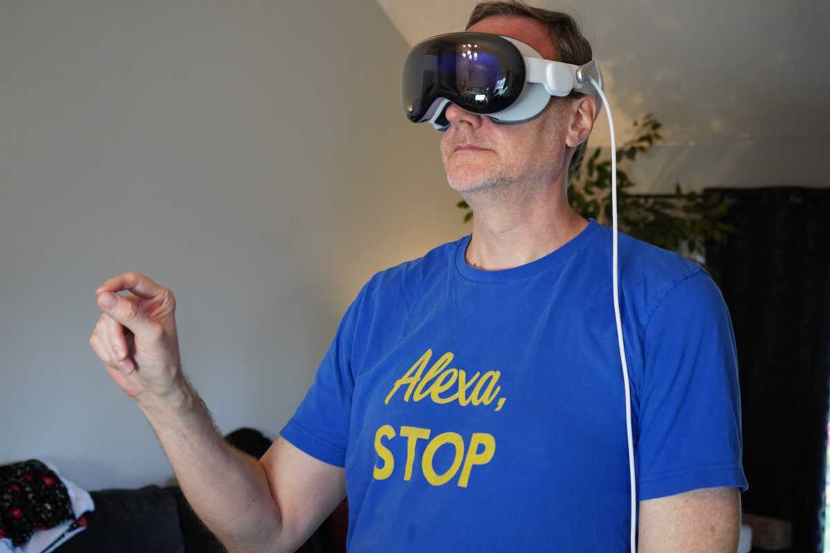
Foundry
But then you try to do stuff and you realize that you’re just turning your head all over the place to use lesser versions of the apps you have on your Mac, and these floating windows are getting in the way of each other. With few exceptions, opening up new windows on your Mac (perhaps adding them to new Spaces) is faster and easier.
An example: While working on this review and taking notes on my MacBook in a virtual display, I used the floating visionOS Safari window to my left to order some wings for lunch. I was able to successfully navigate the site and place my order, thanks in large part to address autocomplete and easy Apple Pay checkout (you do not want to type a credit card number on the visionOS keyboard), but it would have been a lot faster and easier with a real cursor and keyboard. I could have opened a browser tab on my Mac, made my order, and closed it again in less than half the time as fiddling around with look-and-pinch in visionOS. And I could have used the browser of my choice.
The entire Apple Vision Pro experience sometimes feels that like that. The first few times you do something, the possibilities are so exciting that you lose sight of just now inefficient it all really is right now. As time goes on, you realize you could just do whatever you’re doing faster and easier on your iPhone or Mac. Better apps and better visionOS features will improve all that, but it’s not here yet.
Incredible but isolating media consumption
If there’s one area where the Vision Pro app experience does not let you down, it’s media consumption. Between the impressive built-in speakers and spatial audio, the beautiful and bright displays, and all the magical head and hand tracking, simply watching videos is an absolute delight.
Whether it’s Apple TV+, Disney+, or even Netflix in a browser (there’s no Netflix app), viewing flat content is gorgeous. It’s sharp, bright, and has great color and dynamic range. Some apps let you watch in a virtual environment, like the Disney El Capitan Theatre or the sands of Tatooine. Movies made for 3D have never looked better. Watching the latest Avatar or Guardians of the Galaxy in 3D just about beats a real movie theater.
Then there are the “spatial” videos, the 180-degree 3D video that Apple has made available in the TV app. There are a handful—among them an immersive dinosaur experience, an up-close meeting with rhinos, and an Alicia Keys performance while you’re standing next to her piano—and they’re all spectacular.
They’re also not entirely new. There are lots of 3D 180-degree or 360-degree videos out there on the web, including on places like YouTube and DeoVR. But playing these videos through the web doesn’t work at all right now, and won’t until Apple supports the proper WebXR standards. Stand-alone video players like Moon Spatial Player and Reality Player are working on support for these videos, but it’s all pretty rough and buggy right now.
The thing that strikes me most about media consumption is just how isolated it is. Obviously there are times when you want that, but watching movies or TV is often a very social experience. When I showed the Disney Theater to my wife, the very first thing she said was, “Wouldn’t it be cool if you could look to the side and see me in the seat next to you, and I could see you, and we could watch a movie together sitting next to each other even if we were hundreds of miles apart?”
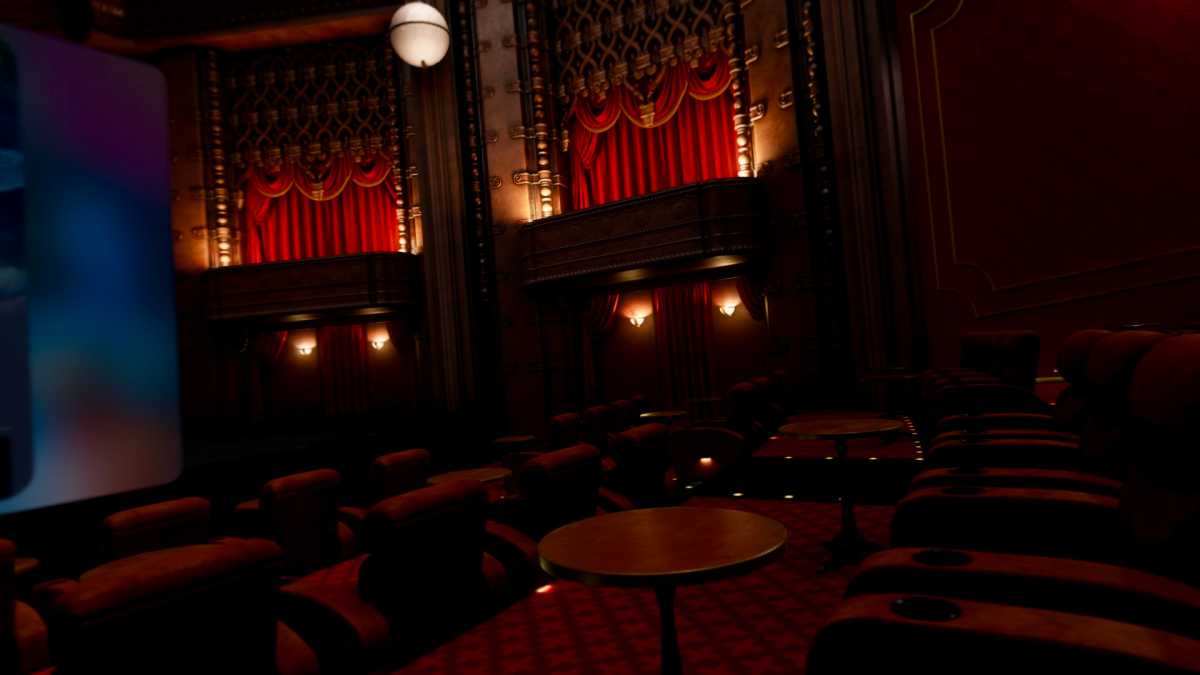
Foundry
It’s such an obvious scenario, such a perfect “you can only do this in Vision Pro” example, but it’s not something Vision Pro can do with ease. Apple has all the pieces—Personas (in beta), SharePlay, spatial audio—they just need to be glued together better. One would think that this sort of “only on Vision Pro!” experience would have been a top priority during development, rather than just watching video in a virtual environment at a higher quality than on the many other VR headsets that have been doing virtual theaters and environments for years.
Speaking of 3D video, capturing spatial videos with the Vision Pro or your iPhone 15 Pro is surprisingly great. The resulting video, limited though it may be, is like looking into a live diorama cutout of a moment from your past. There are plenty of restrictions—it works best at a distance of 4-8 feet and requires a steady camera—but this is honestly a much better way to relive moments than flat video. It feels weird to say it but it’s the closest thing Vision Pro has to a killer feature.
Pricing that is out of control
While we don’t review products based on price, obviously value is always a consideration, and the pricing of Apple Vision Pro must be discussed. Not only is the device crazy expensive, but just about everything involved with it is.
For the headset itself, one could almost justify the sky-high starting price of $3,499. Yes, that’s literally seven times the price of a Meta Quest 3. But with the insanely great displays, hand and eye tracking, and all the other things that produce a drastically higher-fidelity experience, you can almost justify it. Almost.
But what is up with the pricing of all the other Vision Pro stuff? Most of it is priced at $199, no matter what it is (a huge red flag if there ever was one). It’s almost as if Apple is just trying to see what they can get away with.
The Travel Case would be overpriced at $149, and it costs $199. A spare battery, despite holding less power and being less functional than most $69 power banks, costs $199. The light seal, which is just some foam and fabric and magnets, would be “Apple Priced” at $49, but costs (you guessed it) $199. An extra single or double band each costs $99, which is easily double what they should.
Even the app developers seem to be thinking that if you’ll pay almost $4,000 for this headset, you have money to burn. I can really appreciate the Juno app as a sort of “wrapper” around the YouTube API given that YouTube doesn’t have its own app, but should be a $1.99 app at best, not $4.99. So many other apps feel totally barebones and borderline unusable unless you pony up for pricey subscriptions, like cooking app Crouton (which warns you emphatically not to cook while wearing Vision Pro).
It’s hard to see spatial computing as The Future when everything about it feels so expensive. It feels like a hobby for the kind of wealthy people who drop money on app subscriptions without a thought, and not in keeping with democratizing exciting new technology. I look forward not only to a more affordable spatial computing device, but a more affordable spatial computing ecosystem.
Areas of improvement
Speaking of what I can’t wait to see in a future version, a better price is just the beginning. There are so many things Apple needs to address before this can really take off.
Obviously, there’s the visionOS stuff. I should be able to anchor apps to me not to the environment. There should be a class of “heads-up-display” widgets that stick in my field of view. The entirely isolating experience needs to feel more social, with immersive SharePlay video viewing, much-improved Personas, and real spatial-oriented social media and communication apps from third-party developers. Window management and text input need a massive overhaul. It needs more gestures and some variety of multitouch, as well as Find My, Weather, Calculator, and all the other missing apps, and real spatial versions of the iPad apps.
But some of what the Vision Pro needs can’t be addressed without new hardware. The field of view is a bit too narrow with noticeable black borders like seeing the world through a scuba mask (Apple won’t say what it is, but it looks like 100 degrees). It needs to shed about a third of its weight. Video passthrough might not be necessary down the road, but in the meantime, it needs to be a lot better, especially in low light.
Then you’ve got the way this hardware was meant to basically be used indoors at your home or office. There’s no cellular connection, and no way for apps to follow you or to be anchored to objects that move. Remember that next time you see someone pretending to use one in public on your social feeds.
The USB-C port on the battery back really should be used for both power and data, too. That would enable physical security keys, microphones and audio interfaces, HDMI input (with an adapter), external storage, and a host of other extremely useful functions.
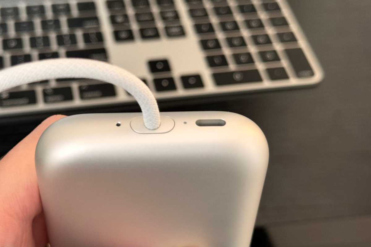
Foundry
Vision Pro needs to demonstrate why it must exist
There’s so much interesting new stuff going on with Apple Vision Pro that one could opine about it all day. It’s not just Apple’s newest device, and the most expensive first device in a category from Apple since the original Mac (when adjusted for inflation). There are entirely new interaction models at play, social mores being tested, and the legal and regulatory challenges are surely just getting started.
At the end of the day you have to make a judgment call: Is this first-generation device worth it? Leaving alone that Apple’s other first-gen products were never priced this far beyond their competitors, its still hard to recommend right now.
More than anything else, Apple Vision Pro needs to demonstrate a reason why it must exist. There’s nothing you can do with it right now that can’t be done in some other way, usually easier, faster, and more affordably. It desperately needs some “killer apps.” It needs to do things that you just couldn’t do if you didn’t have “spatial computing” and floating some iPad app windows around your apartment isn’t it.
There’s a ton of promise, both for this device specifically and the broader spatial computing push in general. But we don’t review potential, we review products. Apple Vision Pro the product, not the idea, is still too limited, too isolating, too minimally useful either for productivity or entertainment to be worth jumping in on.

