The Windows Start menu is undergoing a redesign that makes an unnecessary change.
A new test version of Windows 11 is available for Windows Insiders on the Dev Channel with Build 26120.961, which rolls out a significant change: a new Windows Start menu.
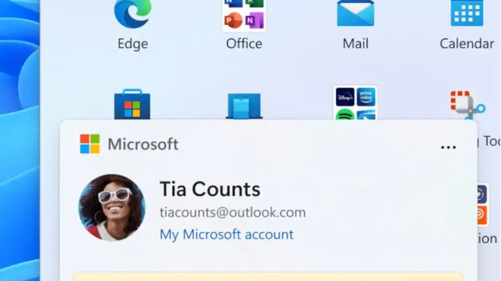
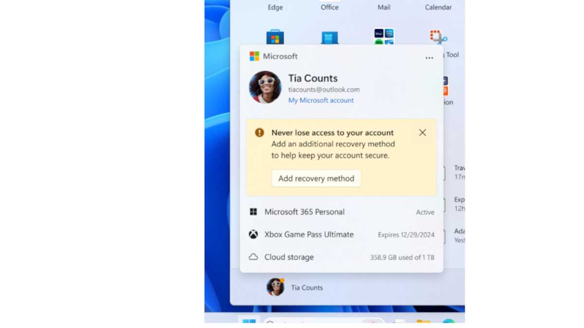
You’ll immediately notice that Microsoft has redesigned the Microsoft user account display, moving it to the center of the Start menu as soon as you click on the username or profile picture.
This new “account manager” feature gives you quicker access to your various Microsoft accounts, such as Microsoft 365, Xbox Game Pass, and OneDrive cloud storage. A recovery method for your Microsoft account is also clearly offered here.
Microsoft
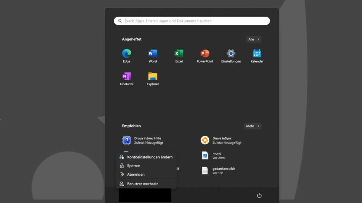
To no surprise, Microsoft is using this prominent display to remind you of their own products and services. The difference to the current Windows 11 Start menu is obvious, as the following screenshot shows:
HCD
Microsoft justifies the redesign by saying:
This update begins the rollout of the new account manager in the Start menu. When you sign in with a Microsoft account, the new design gives you a quick overview of your account benefits and makes it easier to manage your account settings.
However, the redesign has a noticeable side effect: the “Lock,” “Sign out,” and “Switch user” options that used to be immediately available are no longer there in this newly designed menu.
Instead, as Windows Latest shows, you now have to click on the three dots at the top right of the new user account menu to reach the “Sign out” and “Switch user” options. Furthermore, the “Lock” option is gone.
Going forward, an extra mouse click will be needed for these relatively frequently used actions—actions that are certainly needed more often than, say, accessing your Xbox Game Pass account (if you have one) or your Microsoft 365 account (if you have one).
We don’t yet know when this change will roll out for all Windows 11 users. The next major autumn update (24H2) could be a likely candidate.

