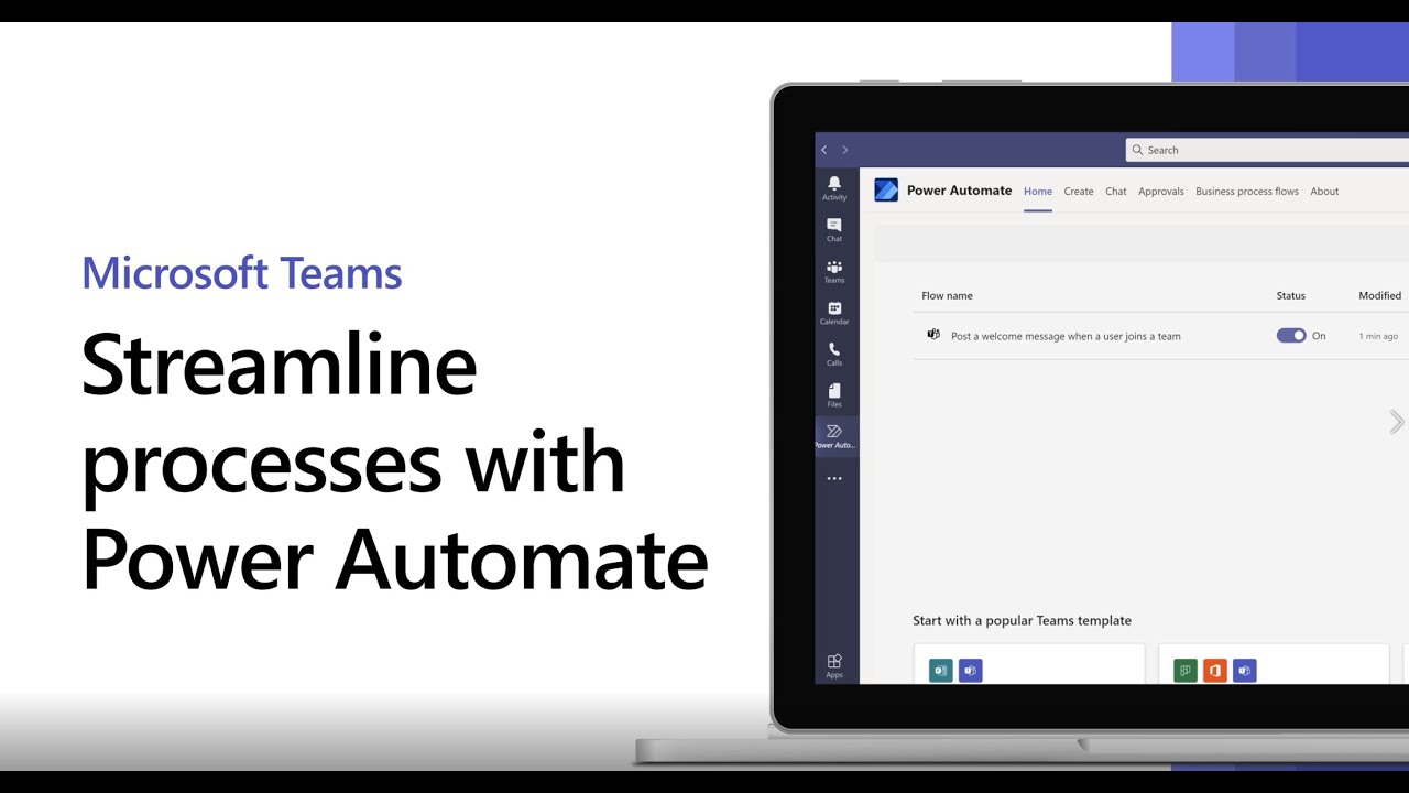
Microsoft is set to test a new interface for Teams in November, giving users more control over how they view and manage chats, channels, and workflows. In the upcoming update, Microsoft will allow Teams users with access to the public preview to experiment with a single, combined feed that consolidates various channels, team spaces, and private chats into one unified interface. This streamlined approach is optional, letting users choose whether to embrace this new layout or stick with the current interface.
This redesigned Teams interface isn’t just about bringing everything into one feed; it also introduces filters, letting users narrow down their view to only specific types of messages, such as channel communications or “@” mentions, directly on the main screen. Additionally, it supports customizable groupings, allowing users to organize chats, channels, meetings, and even AI agents or Teams bots into custom groups based on their own workflow needs. Unlike a rigid AI-generated organization, this approach acknowledges that users know their own workflows best, which could lead to a more intuitive experience.
The favorites section, where users can pin important chats and channels, will remain unchanged, preserving the familiar elements of the current Teams experience. Another significant addition Microsoft will be testing this quarter is threaded conversations, with a wider rollout of this feature expected by mid-2025. Threaded conversations are likely to enhance collaboration by keeping responses and topics neatly organized within channels.
Though users often find Microsoft’s UI updates disruptive, this new design seems flexible enough to ease the transition. With options to retain the classic look or embrace the new interface, Microsoft is allowing users to personalize their Teams experience to suit individual preferences.


