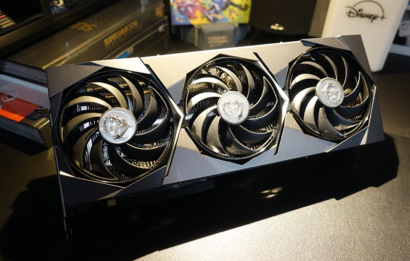
The ever-changing landscape of the ‘gamer aesthetic’ traverses a shifting terrain. Emerging from the transparent plastics of the ’90s to the current expanse of rainbow LEDs and brushed metal, we’ve witnessed numerous trends ebb and flow. MSI, too, has evolved, especially in the realm of customized graphics card designs.
MSI’s shroud designs carry a distinctive signature, prominently featuring fans in the forefront, a hallmark of both double- and triple-fan cooler designs. Recent iterations showcase an eye-catching octagonal aesthetic. However, a journey back to the original GTX 260 design in 2008 reveals a simpler era with an elevated cooler, smaller fans, and an all-aluminum shroud.
Tracing the evolution of MSI’s cooler and shroud designs unveils a progression towards larger fans, expanded heatsinks, and overall more robust structures. The shift from aluminum covers to widely-used plastics and the adoption of the iconic red-and-black color scheme transpired in the 600 and 700 series cards. As the series progressed into the 900s, elements such as the recognizable “dragon” branding became synonymous with MSI graphics cards. Contrasting this, the Ventus and Evoke lines offer a more minimalist and straightforward design, providing a visual departure.


