Microsoft is redesigning its Teams chat interface — in a way that mimics the organization of, say, PCWorld’s home page.
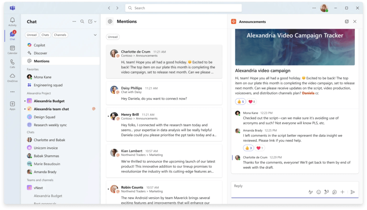
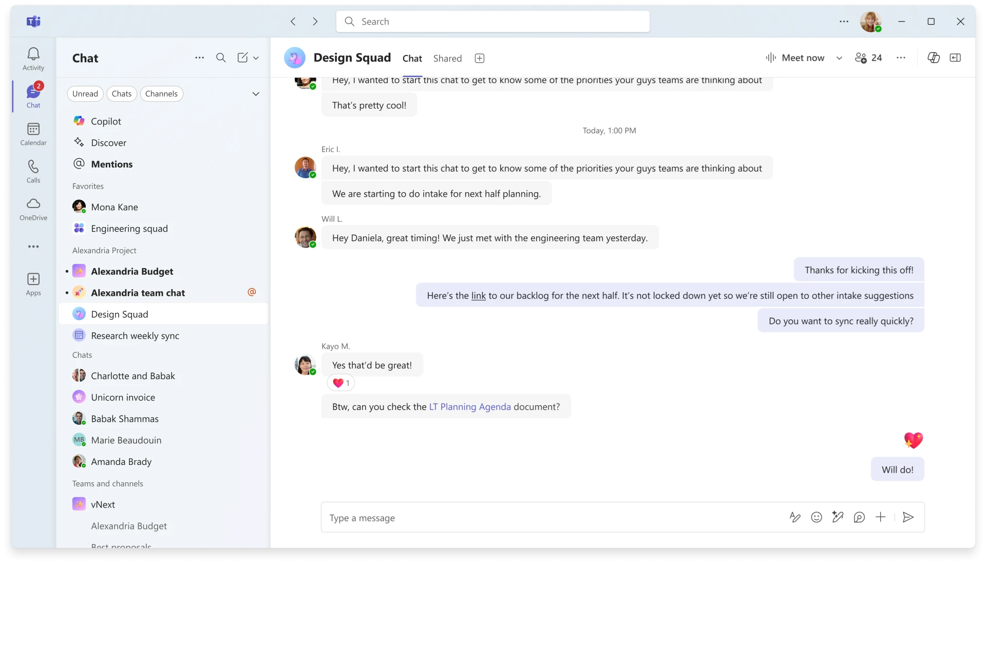
Microsoft said Monday that it will begin testing a new Teams interface in November, optionally collapsing various channels, teams, and chat options into a single feed. Customers with access to the Teams public preview will be able to try out this new interface next month, Microsoft said today.
On the surface, the new chat interface appears similar to how PCWorld organizes our latest articles. What we call a “crawl” of articles progresses down the PCWorld home page, mixing in news, tips, how-tos, reviews, and more. If you want to see reviews and only reviews, you can visit our reviews page. Otherwise, everything is combined inside a single column of information.
The new Teams interface takes this approach, but also builds upon it further. While the new chat interface combines channels, teams, and private chats, you can opt into this new approach, or keep things the way they are. You can also treat particular categories as filters, so that you’ll only see channel messages or “@” mentions in the main interface. You can also keep chats and channels in separate interfaces, too.

The new approach also seems to treat these Teams channels and chats as something similar to tabs, as there’s an additional twist that seems particularly useful: You can group whatever chats and channels — as well as meetings, Teams bots, or AI agents — into custom groupings. That allows you to create your own workflows yourself, without bouncing around and searching for relevant information. Microsoft could have used AI to do this, and it might in the future. But it’s also an admission that you know your own workflow better than it does.
Microsoft said that it’s leaving its favorites section unchanged, bringing together all your pinned chats and channels from the previous experience.


