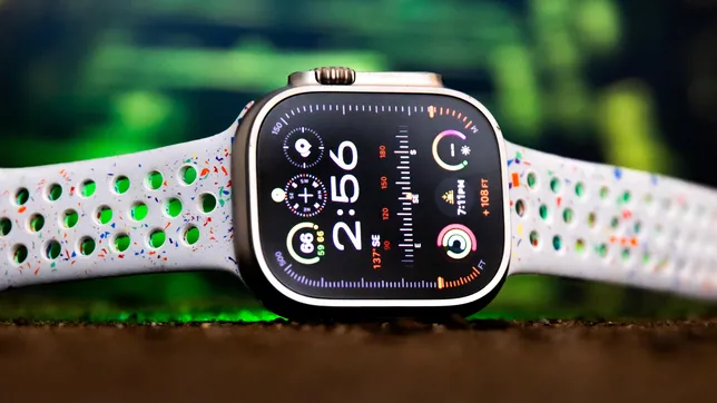
The Apple Watch Ultra 2 doesn’t try to reinvent the wheel, simply because it doesn’t have to. After wearing the Apple Watch Ultra 2 for a week on hikes, bike rides and some casual spelunking (seriously!), it has less of a wow factor compared with the first Ultra. And that’s only because it feels so familiar. It’s available now alongside the Apple Watch Series 9, which shares the same upgraded chip.
Like Apple’s first Ultra, the Apple Watch Ultra 2 costs $799 (£799, AU$1,399) and is sold as an outdoors watch with a rugged design and a range of sports features. The Ultra 2 still has a customizable action button, fall and car crash detection, ECG, temperature sensor, dual-frequency GPS, and built-in LTE. It shares the same heart rate sensor, which is incredibly accurate, and has the same collection of sports features to suit divers, runners and outdoor enthusiasts. It also looks identical to the first Ultra, even though the 49mm case is now made from 95% recycled titanium.
So what is different? The screen, chip and new Double Tap feature are the key highlights. For hikers and cyclists in particular, the Apple Watch Ultra 2 has a lot to offer, but that’s more a reflection on WatchOS 10 than the hardware itself. You’ll be able to get most of the same great experience on earlier, compatible Apple Watches too, including the original Ultra, which I named the most exciting watch in years when it came out in 2022.
That blisteringly bright Apple Watch Ultra 2 screen
It’s impossible to spot the difference between the original Ultra and the Ultra 2 — that is, until you see the screens. Apple has cranked the brightness to 3,000 nits on the Ultra 2, earning it the title of the brightest screen on any Apple product. The iPhone 15 Pro by comparison reaches a peak brightness of 2,000 nits, the same as the original Apple Watch Ultra.
I took the Ultra 2 on a hike in the Marin Headlands on a bright overcast day, then to Ocean Beach in San Francisco when the sun was in full force the following day. I didn’t have any issues seeing the screen in either situation, whether it was a quick time check, reading a message or glancing at my workout stats. To be fair, I had no issue with the screen brightness on the first Ultra when it comes to readability and outdoors use.
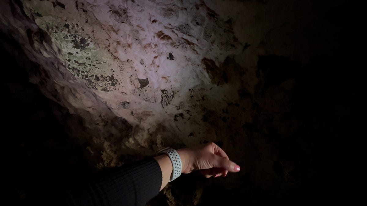
But it’s the flashlight that gets a bigger boost. I took the Apple Watch Ultra 2 into a cave and it lit up the rockface much better than the first Ultra when I compared the two.
You can even force the Ultra 2’s flashlight to hit maximum brightness by turning the digital crown, which is something you can’t do on the first Ultra. Side note: Don’t do what I did and crank the brightness on the flashlight in a dark room, screen aimed at your eyes. My retinas are still cursing me.
From a safety point of view, the brighter flashlight is great if you’re walking, running or riding at night. But you can’t see workout stats, messages or make a call without losing the light. Maybe in the future, the edge of the screen could stay at maximum brightness so you could still interact with the watch and not lose the light. I’m still not totally sure what the best use case is for this brighter new screen if it’s not for safety purposes, given the screen on the first Ultra was bright enough for just about any environment.
On the flip side, the Apple Watch Ultra 2’s screen also gets dimmer than the first watch, going down to just one nit when you have the watch in sleep mode. It can also get that dim if the screen isn’t active and you’re in a really dark room.


