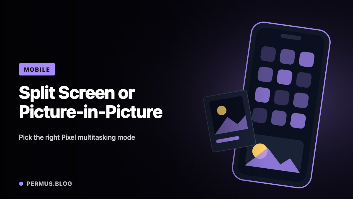
Keeping two things visible on a phone can reduce the effort of switching between apps. Yet not every multitasking task benefits from the same layout.
Reading instructions while writing notes calls for two usable app areas. Watching a supported video while checking something else may work better with a small floating player. On Pixel phones, these are different experiences: split screen and picture-in-picture.
The choice should follow the task, the available screen space, and what the apps support.
Split screen gives two apps their own space
Google’s Pixel instructions describe opening an app, entering the recent-apps view, tapping the app’s icon, and selecting the split-screen option before choosing another app. The exact presentation can depend on the software version.
To leave the arrangement, drag the divider toward the edge of the screen. Google also notes that support depends on the app, and some instructions apply only to particular Android versions.
A practical example is keeping a reference page visible while entering notes. The advantage comes from being able to compare the source and the draft without repeatedly losing your place.
However, two visible apps do not automatically create a comfortable workspace. A long form, a dense spreadsheet, or a large on-screen keyboard can leave too little room for useful reading.
Picture-in-picture serves a different purpose
Picture-in-picture places supported content in a small window over another app. Android’s developer documentation distinguishes this from split screen, where apps share the display in separate areas.
The platform documentation also explains that multi-window behavior varies with Android version and device type. A demonstration recorded on a tablet or another manufacturer’s phone is therefore not a reliable promise of identical behavior on every Pixel.
For a supported video, picture-in-picture can suit a task where the moving image remains useful but does not need most of the display.
It is less suitable when the video contains small instructions, detailed diagrams, or text that you must read accurately. In that situation, a larger viewing area or deliberate app switching may be more effective.
Evaluate the complete task
Try the actual activity rather than merely confirming that the layout opens.
If you plan to take notes, activate the keyboard. If you need to read a diagram, display that diagram. If the task includes scrolling between sections, check whether you can still maintain your place.
For example, a recipe page beside a shopping list may work well while reviewing ingredients. Once the keyboard appears, the same arrangement may become cramped. That is a reason to adjust the workflow, not evidence that the feature has failed.
Save important work before experimenting with an unfamiliar app’s layout.
Treat missing options as a compatibility question
If a split-screen or picture-in-picture option is unavailable, start by checking the app’s support and the phone’s software-specific instructions.
Avoid assuming that every app should behave like a video player or that a missing control means the phone needs to be reset. App capability and device presentation are part of the feature.
The most useful layout is the one that keeps the necessary information readable while leaving enough room to act. Sometimes that means split screen, sometimes a floating video, and sometimes simply switching between full-screen apps.